How the Toronto Symphony Orchestra uses graphic design to guide audiences
The Toronto Symphony Orchestra’s ‘listening guides’ make use of symbols and morse code-like notation to aid the experience of a live performance. We talked to their creator, Hannah Chan-Hartley, about how she is helping the TSO to visualise its repertoire
Hannah Chan-Hartley is the managing editor and musicologist at the Toronto Symphony Orchestra (TSO). She oversees the production of the orchestra’s various printed programmes, from designing layouts and writing and editing content, to the creation of its intriguing ‘listening guides’ with graphic designer Gareth Fowler.
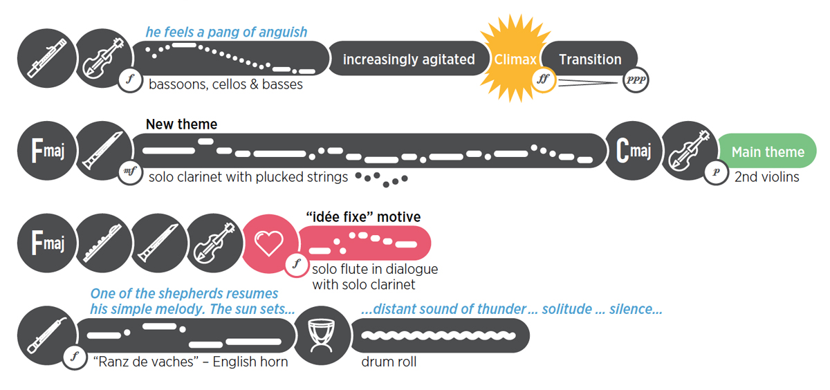
The guides have been a part of the TSO’s main house programme book, Key, since the beginning of the 2015/16 concert season, when the publication was redesigned in collaboration with agency Haft2 in Toronto. But they recently caused a flurry of interest online when percussionist Chester Englander tweeted an image of the listening guide for Brahms’s Symphony No. 4 in E minor, Op. 38, while waiting to go on stage and perform with the TSO (photo shown below and at top of post).
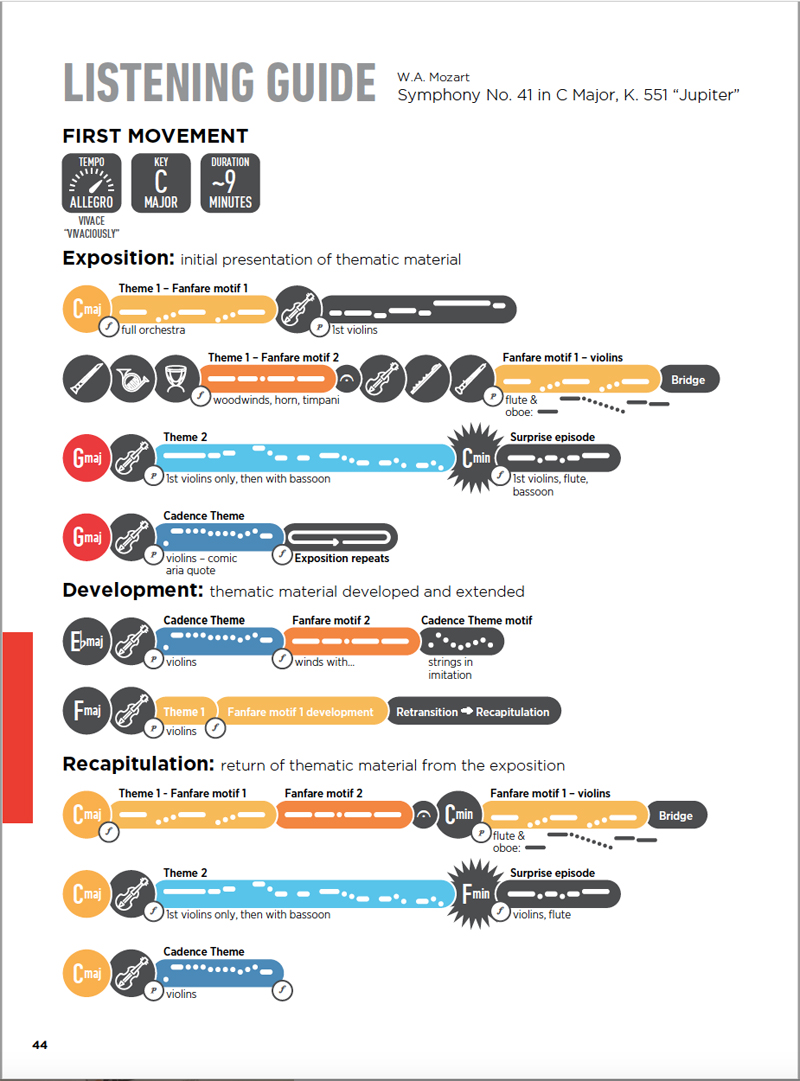
A deft mix of text and graphics, the guides can be read while listening to the performance, their layout visualising the thematic progression of the music, indicating the keys in use, what instruments feature and, using morse code-like notation, their duration.

“Guides of all types to aid listening and comprehension of symphonic music have existed since the mid-to-late 19th-century, when permanent orchestral institutions were being established in Europe and North America,” Chan-Hartley explains.
“Then, as now, the guides were created to help develop audience appreciation for the art form. We wanted the TSO’s programme books to further enhance this experience as well as to provide engaging and informative content for audiences”. They have so far appeared in eight difference iterations, accompanying a variety of performances from Beethoven’s Symphony No. 5 and Debussy’s La Mer, to Mozart’s Symphony No. 41 (Jupiter), shown here.

The guides themselves are unusual in that they stand out against the trend for written programme notes – textual descriptions of a piece of music that include details on historical context, initial reception and particular elements to listen out for in a performance.
Chan-Hartley says that other types of guides may combine descriptive text with music excerpts of themes in standard music notation, while there are even YouTube videos that feature “graphic notation that ‘light up’ as the music is played”. There are also “a number of elaborate apps with which you can simultaneously watch the orchestra perform and the music score as it moves across your screen, as messages pop up to alert you to interesting features of the piece”.

In developing the listening guides for Key, Chan-Hartley says she “wanted to remove some of the barriers to comprehension that more ‘traditional’ guides you see in print tend to have. For one, these traditional aids often have a lot of descriptive text, which you have to read through and then remember as you listen to the piece. I wanted my guide to be visual, and one that you can follow along with in ‘real time’ while listening.
“Secondly, only people who can read musical notation would find the excerpts in the traditional guides useful, so I wanted a graphic way to represent what is being heard so anyone could understand.
“And finally, I wanted the guide to be in a format through which you could visually grasp the overall structure of a symphonic movement or an entire symphony – by showing when the main musical themes are presented, developed, and recur, and thereby help to structure your listening”.

The process of creating a listening guide involves several stages. Firstly, Chan-Hartley conducts an analysis of the form of the piece by listening to a recording with the music score. Based on her analysis, she then provides a list of notes and excerpts in music notation for graphic designer Fowler.
They then meet for a ‘guide development session’, during which they listen to the piece and follow along with Chan-Hartley’s notes. Based on these, Fowler then lays out the initial draft of the guide to see how all the elements fit – various edits and revisions follow. Once the overall structure, notation, and instruments have been set on the page, Chan-Hartley then determines which themes and keys get colour treatment.
The reaction to the guides has been very positive, she says – not least from graphic design fans fascinated by Englander’s tweet from earlier in the month. “I’ve seen patrons follow the guides during the concerts while others have said that they use them when listening at home,” says Chan-Hartley. “I’ve had music teachers contact me expressing interest in them as a resource for their classrooms, and our younger patrons (20s and 30s) seem to really like the visual aspects. I hope for everyone, whether new to the symphonic art form or a seasoned symphony goer familiar with the repertoire, that the guides are engaging and helpful”.
Below, Chan-Hartley offers some further detail on how she arrived at the current format and design for the guides:
Layout
To make the overall structure of a symphonic movement easier to grasp visually, the analysis of each movement of the piece has to fit on one page (one exception was the last movement of Brahms’s Fourth Symphony which appears as a two-page spread). Because of this limitation, I have to choose the most salient aspects of the movement to feature. Thus, the guide is not intended to be a comprehensive representation of the musical score, but rather, is like a map of sonic landmarks.
Notation
The first listening guide Gareth and I worked on was of Beethoven’s Fifth Symphony. As it turned out, during WWII, the symphony’s famous opening theme (‘da-da-dah-dum’; or ‘short-short-short long’) had a coincidental likeness to the resistance symbol ‘V’ for Victory in Morse code: three dots and a dash. This essentially inspired a system of dots and dashes that became the notation for all of our listening guides. We think it is fairly easy to follow and visually appealing, while easy to keep consistent across guides.

The notation has since further evolved so the lengths of the various dots and dashes now correspond to duration values in standard music notation (for example, a dot = 1 eighth note; thus, a quarter note, being 2 eighth notes, is two dots merged together to make a dash).
For each theme or motive, the notation is put in a ‘pill’, and the position of the dots and dashes within the pill follows the contour of the musical notation you see in the score. Besides dots and dashes, we’ve used other shapes to represent other musical gestures – squiggles for trills, ‘curves’ and ‘waves’ for rising and falling motives. The goal is to represent what is ‘heard’ as opposed to always matching the musical notation note for note.


Colour
Since the basic structure of a movement of a symphony is shaped by the presentation and recurrence of musical themes, we highlight these main musical themes by assigning them a colour. The colour helps to orient you to the listening guide, an additional visual indicator of when you should expect to hear certain themes. The key(s) (e.g. C minor, A major) on which a particular movement of a symphony is centered is also set in colour as it is also a sonic indicator of where you are in the movement.
The choice of colours used is not random though subjective – for the themes and the keys, I try to choose colours which I feel represents the character of the key or theme and also the mood of the movement. Themes that appear in multiple movements are in the same colour throughout.

Instruments and dynamics
To further aid listening, we include the musical instrument(s) that play the themes as they occur as well as the dynamic levels (p for piano (or soft), f for forte (or loud), etc.) at which they are played. Gareth has developed a wonderful set of icons to represent the various instruments of the orchestra. For clarity, we also name the instrument underneath each thematic pill. A ‘legend’ explains the various symbols pertaining to dynamics.
More on the Toronto Symphony Orchestra at tso.ca. Hannah Chan-Hartley is on Twitter at @hanchanhartley
